Dealing with Ads in 2020

As you may know, I currently work for a news company in Germany, the Rheinische Post Mediengruppe. My task there is to concept and build the frontend for a bunch of news sites in the form of a white label framework. Sadly, but not surprisingly my client is still depending on ads to generate revenue. Which is why we wanted to adjust our frontend to be in a better position to deal with them. Mostly because...
Ads suck! #
And there are many ways in which they suck:
- Ads are still sold to customers as fixed-sized canvases, counteracting the idea of true responsiveness.
- Ads have a substantial negative impact on a site's performance, be it render time, time to interactive, or general input lag.
- Ads take a massive toll on user happiness due to all the layout shifts they create, which make people lose their focus and which break the back button experience.
- So-called skyscraper or wallpaper ads tend to make sure that they are always visible even if this means that they cover essential site UI like the header or menu.
- And ads sometimes turn out to be trojan horses who's innards try to steal sensitive data from you without you noticing.
Oh yes, ads really are a kind of its own. But for us, there was no way around them, so we needed to find ways to work with them and to minimize their impact.
Ads & Responsiveness #
Back in the days, the newspaper I work for had a standard website for desktops and an mdot site for mobile. This setup made integrating ads into the site pretty straight forward, because we knew when to send the ad code for desktop devices and when the one for mobile devices. But maintaining two separate sites has a lot of drawbacks, too:
- you need to develop many features twice
- you constantly have to keep your list of devices and corresponding user agent strings up to date to continue sending visitors to the right site
- you constantly had to troubleshoot your URL scheme.
These drawbacks were the reason why for our relaunch, we wanted to go the responsive route, which would make user agent sniffing redundant, too.
We had to find a way to send down the ad codes both, for desktops and for mobile devices, down the wire and then to have the client somehow sort out which one of the two to execute. Not too hard to achieve. But now comes the real challenge: The people working in the ads division putting corresponding code into our site are no programmers. They do get isolated code snippets via email or from documentation, either for a mobile or a desktop ad and all they do is paste those into textareas labeled "mobile ad code" and "desktop ad code". They are not able to transform and combine them into one responsive ad loading code. We had to develop a generic solution that would handle the task.
One way to do this is to leverage the power of Web Components by putting both snippets in separate <template> elements and then to import the correct one into the current DOM, like so:
<div class="ad">
  <template class="ad__mobile">
    // Mobile ad HTML code with inline script
  </template>
  <template class="ad__desktop">
    // Desktop ad HTML code with inline script
  </template>
  <script>
    const isMobile = matchMedia('(max-device-width: 20em)').matches;
    const ad = document.currentScript.closest('.ad');
    const content = ad
      .querySelector(isMobile ? '.ad__mobile' : '.ad__desktop')
      .content;

    ad.appendChild(document.importNode(content, true));
  </script>
</div>
Note that you can't go "all in" with Web Components and make it a full custom element, as ads often rely on being able to reach into the rest of the document. Browser support for the above is quite good, with only IE and Edge < 15 not supporting both document.currentScript and document.importNode at the same time.
The above was not the route we chose, though. When we started developing our site in late 2017, Web Components support in Edge was not yet there and we still had a considerable amount of IE traffic that we wanted to monetize. So our approach was a different one. The way to go was still to deliver both ad codes but to use document.write to render one of them useless at parse time. One idea would have been to use an HTML comment, like so:
<div class="ad">
  <script>
    (function() {
      var isMobile = matchMedia('(max-device-width: 20em)').matches;
      if (!isMobile) {
        document.write('<!--');
      }
    })();
  </script>
    // Mobile ad HTML code with inline script
  -->
  <script>
    (function() {
      var isMobile = matchMedia('(max-device-width: 20em)').matches;
      if (isMobile) {
        document.write('<!--');
      }
    })();
  </script>
    // Desktop ad HTML code with inline script
  -->
</div>
The closing comment declarations would be hardcoded into the HTML (-->), whereas the opening declarations would be inserted depending on the device type (<!--), thereby disabling the code in between. But again, this wasn't good enough. Since our people managing the ads would probably just copy & paste code into the respective CMS textareas, we were fully prepared for them to also carry over any HTML comments that they would come across in their code snippets. Just one such occurrence would be enough to transform our whole site into a Frankenstein, due to messed up HTML nesting.
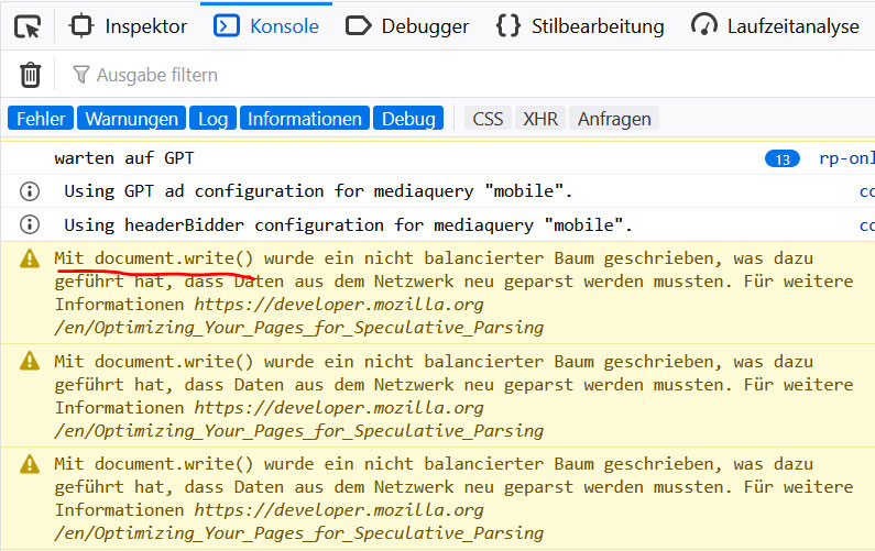
I remembered one more discovery I made a few years back, in regards to HTML, and that was the <xmp> element. This tag has been marked deprecated in HTML 3.2 and completely removed in HTML 5. But browsers still support it. The <xmp> was once meant to display preformatted text and was superseded by the <pre> element. But <xmp> has one huge advantage over <pre>: it does not need HTML to be entity encoded inside it. Similarly to the <template> element, it mutes the effect of any contained HTML, with the only difference being that it would visibly show up in the browser and not hide itself. And the probability of an ad code to break it with a closing </xmp> tag is close to zero. This is the code we went live with:
<div class="ad">
  <script>
    (function() {
      var isMobile = matchMedia('(max-device-width: 20em)').matches;
      if (!isMobile) {
        document.write('<xmp>');
      }
    })();
  </script>
    // Mobile ad HTML code with inline script
  </xmp>
  <script>
    (function() {
      var isMobile = matchMedia('(max-device-width: 20em)').matches;
      if (isMobile) {
        document.write('<xmp>');
      }
    })();
  </script>
    // Desktop ad HTML code with inline script
  </xmp>
</div>
And it worked like a charm, except for Firefox complaining about having to render an unbalanced DOM tree:
Lazy Loading Ads for better performance #
But our ad people would not be who they are if they didn't crank the difficulty level up one notch. After a certain amount of time they asked if it would be possible to have ad slots loaded lazily, when they scroll into view. Because some ads pay off only when they are seen by the user, not when they are loaded. So from a performance standpoint it makes total sense to only load them on demand.
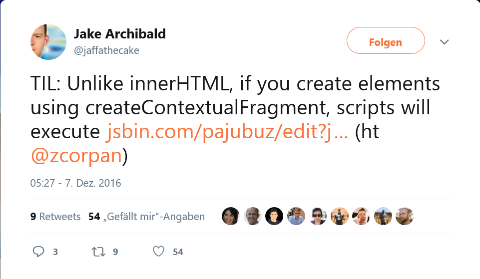
Triggering actions once an element enters the viewport got pretty easy nowadays thanks to the Intersection Observer API (and the available polyfill). The more difficult problem to tackle was how to postpone the execution of arbitrarily shaped scripts into the future. As you might know, just reading out the ad's HTML snippet and injecting it into the DOM via .innerHTML would not execute contained <script> elements. One possibility could have been to parse out any script tags, to recreate them via document.createElement, and then to append them. But then again, how would we handle document.write? Since our base document has finished parsing and is now considered "closed", such a late document.write would replace the whole document, instead of just adding little pieces to it. A <template> element together with document.importNode could solve the problem, but as already outlined above, they are not (yet) an option for us. But I stumbled upon one more interesting DOM feature capable of helping me out: the Range object and its .createContextualFragment() method, creating a, well, Contextual Fragment.
TIL: Unlike innerHTML, if you create elements using createContextualFragment, scripts will execute https://t.co/CfqYAu5pZr (ht @zcorpan)
— Jake Archibald (@jaffathecake) 7. Dezember 2016
And here is how I put it to use (Media Queries and IntersectionObserver code are left out for the sake of a better understanding of the range technique):
<div class="ad">
  <xmp class="ad__mobile">
    // Mobile ad HTML code with inline script
  </xmp>
  <xmp class="ad__desktop">
    // Desktop ad HTML code with inline script
  </xmp>
  <script>
    (function() {
      // We know we must be the last .ad element in the document
      var ads = document.querySelectorAll('.ad');
      var ad = ads[ads.length - 1];
      var xmp = ad.querySelector(isMobile ? '.ad__mobile' : '.ad__desktop');
      var activateCode = function activateCode(html) {
          var range = document.createRange();

          range.setStart(ad, 0);
          ad.appendChild(range.createContextualFragment(html));
      }

      activateCode(xmp.textContent);
    })();
  </script>
</div>
The above snippet enables us to have <script> elements in our code and even document.write and it is easily combined with an Intersection Observer for a lazy load approach. On top of it all, since we do not need to dynamically open <xmp>sections anymore, Firefox stops complaining about the unbalanced DOM tree.
One thing we did not account for, though, is that externally loaded scripts can also contain document.write. Those document.writes won't be caught by our Contextual Fragment, as these scripts are only loaded and executed after we injected and executed our initial code block. External scripts doing document.writes do not happen very often, but unfortunately often enough to consider them. Since we really liked what we saw, we didn't want to give up. We rolled up our sleeves and went ahead to patch document.write.
We had to patch document.write into something that
a) would catch what was supposed to be written into the DOM, then
b) create another Contextual Fragment with that content, which would
c) be appended right after the script calling it.
Here is how that came together:
  (() => {
    // We store the original since we still need
    // it outside of ad containers
    const originalDocumentWrite = document.write;

    document.write = (html) => {
      const sourceScript = document.currentScript;
      const div = document.createElement('div');
      const range = document.createRange();

      // if document.write is called from the console, or
      // if document.write is not called from inside an
      // ad container delegate back to the original one
      if (!sourceScript || !sourceScript.closest('.ad')) {
        // .apply() is needed to reinstate the right context
        originalDocumentWrite.apply(document, [html]);
        return;
      }

      range.setStart(div, 0);

      sourceScript.after(range.createContextualFragment(html));
    };
  })();
The above code uses ES6 as this time it is not an inline script and so can be transpiled. And I am using .closest() and .after(), which you need to polyfill in older Edge browsers, as well as document.currentScript).
Okay, NOW we're finally done. Now we have responsive, and lazily loadable ad slots that work for any type of copy & paste code snippet in the world!
"But what about tablets?", you may ask. Valid remark! For advertisers the tablet category does not exist. For them there is just desktop or mobile, nothing in between. This differentiation means it is upon you as a publisher to decide which of those two categories to serve to tablet users. Since desktop ads bring more revenue, we chose to serve those to tablet users. Now, not every tablet offers the screen size to flank our main content with skyscrapers and the likes. But those bring most of the money!
Our solution was to manipulate the viewport meta tag in a way that we force tablets into creating a virtual drawing canvas of 1325 pixels, similarly to what they fall back to when no viewport meta tag is set at all:
  <meta name="viewport"
        content="width=device-width, initial-scale=1">
  <script>
    // If tablet or bigger, fix viewport to create space for the ads
    // Our cut-off point was at a width of 725 pixels
    // (also see: http://mydevice.io/#compare-devices)
    if (
        window.matchMedia &&
        matchMedia('screen and (min-width: 45.3125em)').matches
      ) {
      // In the first step we also turn off user scaling
      // so that the browser zooms out
      document
        .querySelector('meta[name="viewport"]')
        .setAttribute('content', 'width=1325, user-scalable=no');

      // Then we re-enable zooming
      window.setTimeout(function () {
        document
          .querySelector('meta[name="viewport"]')
          .setAttribute('content', 'width=1325');
      }, 1000);
    }
  </script>
Politely bowing out when the user's connection is constrained #
Sometimes your connection happens to be super slow. You don't need to live in poorer regions of the world to experience slow connections. Reasons can be:
- someone's allocated high-speed traffic volume for the current month is depleted
- someone is part of a mass gathering and the network is overloaded (e.g. New Year's Eve)
- someone travels by train having a super flaky connection (looking at you, Deutsche Bahn)
- someone is on vacation in rural areas (like I experienced each time we were on vacation at a farm), or
- a European travels to Florida, his/her 4G phone doesn't support the US frequencies and falls back to the next slower available connection speed, which turns out to be 2G, as Florida already got rid of its 3G network in favor of 4G (exactly this happened to poor me two years ago)
In those situations it is not desirable to still have ads compete on bandwidth against the main content of your site. Even less so with news sites as sometimes they spread vital information, like informing people when a sgnificant incident happened and what to do. If we leave ads on even at 2G speeds, chances are that neither those nor our main content will ever load.
We wanted to take the user connection into account using the Network Information API. If this API is available we check a visitor's effective connection speed:
const hasFastConnection = () => {
  // Let's also prepared for offline scenarios
  if (navigator.onLine === false) {
    return false;
  }

  // Mark the connection as slow if it falls into the 2G category
  if (navigator.connection && navigator.connection.effectiveType) {
    switch (navigator.connection.effectiveType) {
      default:
        return true;

      case 'slow-2g':
      case '2g':
        return false;
    }
  }

  return true;
};

const initAds = () => {
  if (!hasFastConnection()) {
    console.info('Disabling ads due to slow connection');
    return;
  }

  // initialize the ads
};
You can try it out yourself by throttling the network in Chrome Devtools to "Slow 3G" and then go visit rp-online.de.
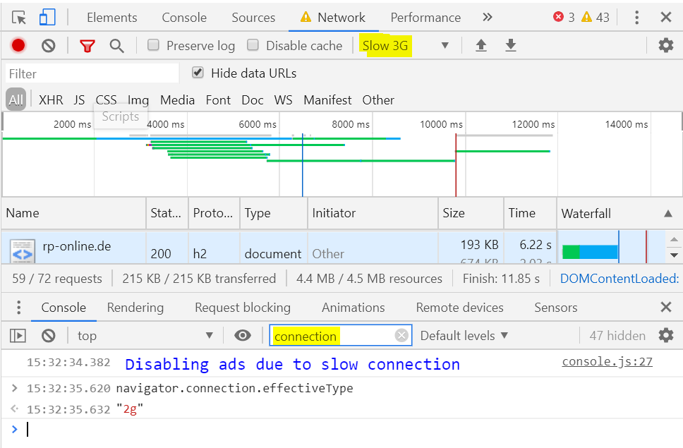
According to the Chrome User Experience Report, this affects 0.02% to 0.03% of our visitors, which, given that we hover around 60M page views per month, still amounts to 12K views.
Bringing stability back to layout #
One other side effect of having ads on your page is that slots pop open once an ad gets loaded into them, thereby pushing the content below it and to its side around. The same happens if you use fixed-sized placeholders in slots and it then turns out that there is no ad with those dimensions left in the pool to deliver, but only smaller or taller ones. Then the slot shrinks or grows, pushing things around. Usability suffers tremendously as the human eye constantly loses orientation and the browser needs to re-layout the page each time (including paint and compositing). Most browsers try to compensate for it through a technique called "Scroll Anchoring", but there are limits as to how good that works. The Chrome team recently added a new performance metric they call "Cumulative Layout Shift" which aims to quantify these problems.
What we did was introducing a new type of placeholder slot, that would always be as large as the largest possible ad format it is configured for, and that would turn any loaded ad inside of it into a position: sticky element that would slide along with the user scrolling the page:
That way, we get around the need to resize the slot once the ad is loaded, thereby reducing the layout shift.
One thing you need to know though with position: sticky-elements which is not mentioned a lot around the internets, is that it stops working the moment one of the ancestors uses overflow: hidden. It turned out we had quite had few elements on our page set to overflow: hidden, mostly to clear floats or to stop things from exceeding the horizontal boundaries of the page on mobile. So we had to refactor these.
In order to find ad slots that are affected with such a constellation, we created the following snippet which we could run in the browser console:
[...document.querySelectorAll('.ad')].forEach((adSlot) => {
  const problematicParents = [...document.querySelectorAll('*')]
    .filter(elem => elem.contains(adSlot))
    .filter(elem => getComputedStyle(elem)
                        .getPropertyValue('overflow') === 'hidden');

  if (problematicParents.length) {
    console.warn('Sticky will break in slot:', adSlot, problematicParents);
  } else {
    console.info('Sticky will work in slot:', adSlot);
  }
});
Now we still needed to find a solution for when there's no remaining ad in the ad server pool. In the past, when that was the case, we collapsed the slot. Our new approach is to have "backup" ads of our own to serve when this happens. These can be ads for our own offers or it could be a piece of usage info about your site, or it could be ads for a good cause, e.g. organizations that can't afford booking ads on larger news sites.
Winning the z-Index Wars #
As mentioned in the introductory section a few types of ads tend to break out of their given place and to cover up important site UI like the header or the navigation. Typical candidates are (sticky) skyscrapers flanking the page that extend to the top and bottom of the viewport, ignoring that there might be a header bar that they shouldn't cover. Another ad format is the fireplace ad that tries to lay itself all around the content: to the left, to the right and above. Covering up navigation leads to people feeling like they lost control over the site.
And then there are ads which do sit where they are supposed to be but that boast such a high z-index that they will even sit there when you've opened your off-canvas menu and then they'll cover that up, too. While there are guidelines by the IAB, the "Interactive Advertising Bureau", on which z-indexes to use as a site owner and which ones to use as an ad creator, seeing what crap comes in over the ad servers makes me have no faith in that standard being applied correctly. Which is why we prefer to take things into our own hands.
What we noticed was that all those ads that ended up covering up things were accessing document.body to append themselves to it. That's when we got the idea to patch document.body! Instead of returning the <body> element, we would return a <div> that extends over the whole surface of the <body> element, but that would come equipped with z-index: 0. And then those ads would become children of that element instead. What seemingly only a few people know is that once a parent of an element is already part of a stacking context child elements cannot stick out higher in the stack than the parent. So now even ads with a z-index in the millions range could not go higher than the stacking height of that new element, which was 0. We then equipped our header with z-index: 4 and our off-canvas menus with z-index: 3 and from that moment on they remained forever uncovered. And how did we patch document.body? With a property getter, supported in all relevant browsers:
Object.defineProperty(document, 'body', {
  get: function () {
    return document.querySelector('.fakebody');
  }
});
Of course, what this meant for us was to revert to document.querySelector('body') every time we wanted to access body ourselves. But that was feasible.
Shielding our Users #
(at least a little bit)
In an ideal world, what we would do is to lock every ad into either an iframe or a Web Component custom element to block it from accessing the rest of the page. In practice, we can not do this, as a lot of ads rely on being able to reach outside of their initial slot. An ad could, for example, turn out to be a fireplace ad which in turn needs to add plenty of graphic elements on all sides and also needs to move the content area of the page around. Or there are so-called "understitials", which open up a hole in your text content, through which to see the ad. Or you have a sticky ad that needs to attach itself to the body. So we cannot restrict them.
Restricting access would be wise, though, as these ads can observe you and read out everything that you type into any sort of input field. And they do! For example, they try to trigger your browser's form autofill feature or hope for autofill to just run to get very sensible data. Maybe to fingerprint and track you across different sites. Maybe to sell your profile data, who knows. And other types of third party scripts do too! If you use the Facebook pixel, it constantly reads out every input you do on the page. The same goes for Google's Recaptcha. Maybe they do that to ensure you are not a robot. Maybe not.
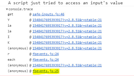
Since we don't want that to happen and we could not lock out the third party, we had to do something else. And again we patched a browser built-in, and this time it was input.value:
(() => {
  // This will hold a list of CSS selectors of inputs,
  // that can be read out the standard way:
  const allowedSelectors = [];

  // Store the real value access
  const realValue =
     Object.getOwnPropertyDescriptor(HTMLInputElement.prototype, 'value');

  // Remap the former .value to a new .realValue property
  Object.defineProperty(HTMLInputElement.prototype, 'realValue', {
    get() {
      return realValue.get.call(this);
    },
  });

  // Create a new behavior for .value via getter
  Object.defineProperty(HTMLInputElement.prototype, 'value', {
    get() {
      // Go though the allowlist and if a selector matches,
      // return the real value
      for (const selector of allowedSelectors) {
        if (this.matches(selector)) {
          return realValue.get.call(this);
        }
      }

      // Otherwise send an alarm and return an empty value
      console.trace('A script just tried to access an input\'s value', this);
      return '';
    },
  });

  // Create an interface with which one can
  // mark certain forms as okay via CSS selector
  window.safeInputs = {
    allowSelector: (selector) => {
      allowedSelectors.push(selector);
    },
  };
})();
What we basically did there was making .value to always return an empty string and hiding the real value behind a new property accessible via .realValue. This allowed us to still read out the form inputs in our own code. On top of that we had an alarm in the console together with a console.trace to find the code that tried to access the input. And finally we added the possibility to allow certain inputs to stay readable (window.safeInputs.allowSelector), as from time to time we have a quiz or something that is not programmed with our patch in mind. This works by handling it a CSS selector à la .quiz input:window.safeInputs.allowSelector('.quiz input') . Now, if you access an input that matches .quiz input, the value stays readable.
The patch does not change anything in regards to normal HTML-based form submission and you can also use the FormData API as normal. Still, the above change is enough to cover almost all third party situations as they never use anything else than .value.
Closing Notes #
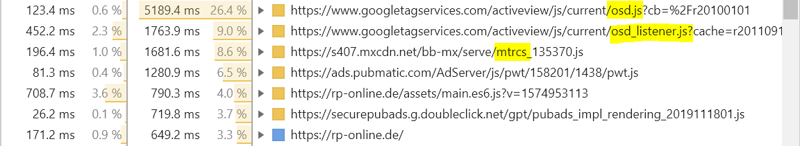
Working with ads is messy and also a bit delicate, because you don't wanna break stuff in a way that cuts off revenue (e.g. break an advertiser's measurement tools). One thing on our list is to take on common scripts like Google's osd.js or Meetrics' mtrcs.js monitoring tool, as both tend to burn most of our CPU cycles.
We think we'd like to probe them to see where exactly they waste processing time. We hope that force-debouncing scroll events and mapping layout trashing reads to less expensive, maybe even async methods in the background will manage to reduce the pressure on our site.
What we would wish for even more is for companies like Google and Meetrics to put out their code on Github and to allow people to send them pull-requests that improve it. But this will never happen.
Do you have similar experiences with ads? Have you also tried decreasing the harm they do on your site? If so, I'd love to hear from you on the Twitters! My handle is @derSchepp.
A thousand thanks go out to Stefan Judis, who was so kind to check this huge post ❤
The cover image of this post is Lord of The Rings • Mordor • Mount Doom • Eye of Sauron by Muna
Webmentions


 +37
+37
-
-
Zum Glück bietet WordPress den Rückumzug zu selbst gehostetem WP an. move.wordpress.com. Das sollte also kein Problem werden. Und dann mach ich das auch bei Uberspace. Wenn Kontrolle, dann richtig.
-
-
-
-
-
-
-
Dealing with Ads in 2020 is an interesting look at the problems and challenges of integrating and displaying ads in the best possible way.
The article slash case-study from Christian Schaefer [“Schepp”] shows the approach they took at Rheinische Post Mediengruppe to implement and deliver ads in a better way than most sites currently do, taking into account responsiveness, lazy loading as well as considering network speeds and security to improve the experience.
-
Christian Schaefer has a great big write-up about dealing with web advertisements. The whole thing is interesting, first documenting all the challenges that ads present, and then presenting modern solutions to each of them.
One code snippet that caught my eye was a simple way to design a component that renders different HTML depending on the screen size.
<div class="ad"> <template class="ad__mobile"> // Mobile ad HTML code with inline script </template> <template class="ad__desktop"> // Desktop ad HTML code with inline script </template> <script> const isMobile = matchMedia('(max-device-width: 20em)').matches; const ad = document.currentScript.closest('.ad'); const content = ad .querySelector(isMobile ? '.ad__mobile' : '.ad__desktop') .content; ad.appendChild(document.importNode(content, true)); </script> </div>Clever. Although note that Christian ends up going a totally different route in the article.
Here’s that same code where I use a custom element and move the JavaScript to JavaScript just ‘cuz.
See the Pen A Web Component with Different HTML for Desktop and Mobile by Chris Coyier (@chriscoyier)on CodePen.
-
-
-
-
-
-
-
-
-
-
-
-
-
-
Christian Schaefer has a great big write-up about dealing with web advertisements. The whole thing is interesting, first documenting all the challenges that ads present, and then presenting modern solutions to each of them.
One code snippet that caught my eye was a simple way to design a component that renders different HTML depending on the screen size.
<div class="ad"> <template class="ad__mobile"> // Mobile ad HTML code with inline script </template> <template class="ad__desktop"> // Desktop ad HTML code with inline script </template> <script> const isMobile = matchMedia('(max-device-width: 20em)').matches; const ad = document.currentScript.closest('.ad'); const content = ad .querySelector(isMobile ? '.ad__mobile' : '.ad__desktop') .content; ad.appendChild(document.importNode(content, true)); </script> </div>Clever. Although note that Christian ends up going a totally different route in the article.
Here’s that same code where I use a custom element and move the JavaScript to JavaScript just ‘cuz.
See the Pen A Web Component with Different HTML for Desktop and Mobile by Chris Coyier (@chriscoyier)on CodePen.
 Joschi Kuphal 吉
 Holger Bartel
 Bianca Kastl
 Fabian Tempel
 dirk döring
 Marc Hinse
 dickelippe
 Stefan Baumgartner
 Tom Tinkerson