????????
Turning a CSS Carousel into a Theme Switcher

Sometimes the web gives you an excuse to play.
When Vasilis van Gemert and the team at CMD Amsterdam University of Applied Sciences announced their free community event The Web You Want, they not only asked for talks, workshops and contributions - they also invited people to submit CSS themes for the event website. Very much in the spirit of CSS Zen Garden: style the page however you want, but don’t touch the HTML.
That constraint is exactly my kind of challenge!
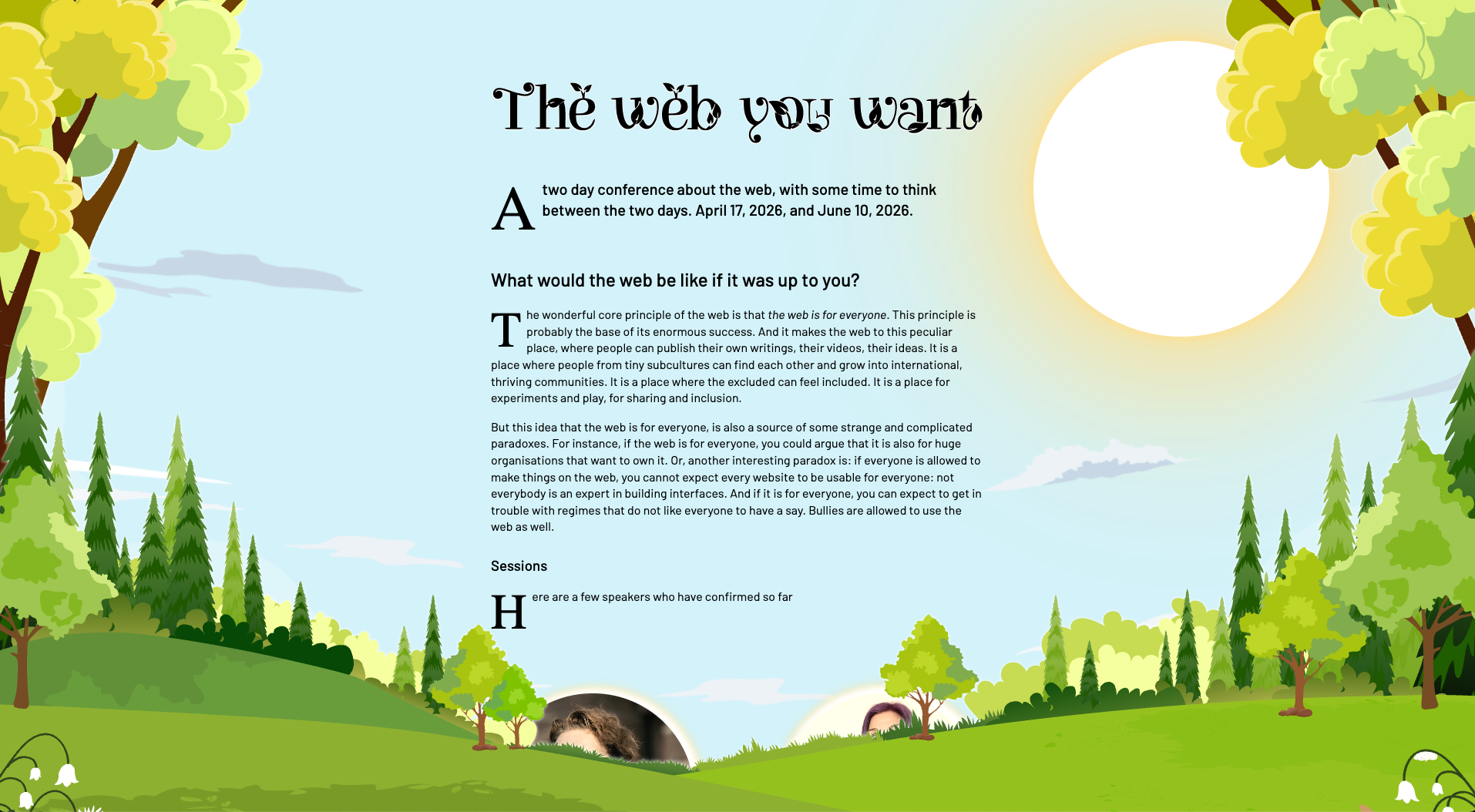
Painting the web a bit warmer #
I wanted something optimistic. Nature-inspired. Maybe a bit solarpunk.
The event’s theme felt forward-looking and constructive, so a warm spring landscape seemed like a fitting visual metaphor. I bought a vector illustration of a bright landscape from Shutterstock, picked up the wonderfully playful Leafy font for the main heading, and paired it with Barlow for the body text.
The vector graphic came as a single EPS file, so I opened it in Illustrator and sliced it into layers - hills, sky, clouds, foreground elements - exporting each piece as SVG. That gave me two important affordances:
- responsiveness (individual pieces can reposition and scale)
- depth (layering elements with content creates a subtle depth illusion)
After a few hours of nudging values and fighting stacking contexts, the scheme felt coherent - and surprisingly robust across browsers.
Respecting user preferences #
One of the design goals was to behave like a good web citizen:
- respect font size preferences
- respect reduced motion
- respect color scheme
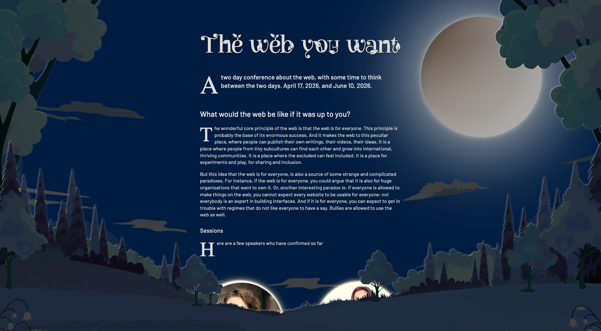
The first two are fairly straightforward these days. Color scheme, however, sparked an idea.
If light mode shows a sunny spring landscape… could dark mode show the same scene at night?
With a handful of color tweaks and quite a lot of CSS filters, I created a nighttime variant that still reads as the same place - just under moonlight.
Initially, this was wired up through the usual prefers-color-scheme media query. Done. Ship it.
Except… it felt very much… buried.
Making the theme discoverable #
If a theme contains two carefully crafted schemes, shouldn’t visitors be encouraged to explore them?
A visible light/dark switch would help. But the rules were clear:
- no HTML changes
- no JavaScript
Classic CSS toggling tricks need some kind of state holder - a checkbox, a fragment target, anything interactive. None existed.
Then I remembered the Chrome team’s CSS-only carousel work.
That (Chromium-only) proposal introduces pseudo-elements such as scroll buttons and scroll markers that behave very much like navigation controls - focusable, keyboard-operable, grouped. In other words: interactive UI created entirely by CSS.
So the question became:
Could I create a fake scroller and use its scroll position as a state machine?
Turning <head> into a UI #
First I needed an element with children that's present on every page, to safely play with the approach. There is exactly one element that satisfies that requirement: <head>.
It isn’t rendered by default, but CSS can make it appear. So I did, and I also turned it into a horizontal scroller and instructed the browser to generate a dot navigation for it via scroll-marker-group: after:
head {
  display: block;
  overflow-x: scroll;
  scroll-snap-type: x mandatory;
  scroll-timeline-name: --head-timeline;
  scroll-timeline-axis: inline;
  scroll-marker-group: after;
  white-space: nowrap;
}
The first three <meta>-elements became the scroll items:
meta:nth-of-type(1),
meta:nth-of-type(2),
meta:nth-of-type(3) {
  display: inline-block;
  width: 100vw;
  height: 1px;
  scroll-snap-align: center;
}
The generated dot navigation is exposed as pseudo element ::scroll-marker-group. I positioned it at the top of the page and turned the markers into buttons with accessible names:
head::scroll-marker-group {
  position: fixed;
  z-index: 5;
  top: 1rem;
  left: 50%;
  display: flex;
  gap: 0.25rem;
  transform: translateX(-50%);
}

meta:nth-of-type(1)::scroll-marker {
  content: url("auto-mode.svg") / "automatic light or dark mode";
}

meta:nth-of-type(2)::scroll-marker {
  content: url("light-mode.svg") / "light mode";
}

meta:nth-of-type(3)::scroll-marker {
  content: url("dark-mode.svg") / "dark mode";
}
I now had a theme switcher.
Without HTML. Without JavaScript. Just CSS.
Reading state without state #
Buttons alone aren’t enough - the stylesheet needs to know which one is active.
I first thought of :has(), but it cannot inspect pseudo-elements like ::scroll-marker, by design.
However, clicking those buttons scrolls the scroller. And scroll position can drive animations. Enter scroll-driven animations!
I turned the scroller into an animation timeline source:
head {
  scroll-timeline: --head-timeline x;
}
I then exposed the timeline globally via timeline-scope on the <html> - and started using it right there:
html {
  timeline-scope: --head-timeline;
  animation: set-scheme 1ms steps(3);
  animation-timeline: --head-timeline;
}
The animation named set-scheme “animates” a custom property:
@keyframes set-scheme {
  from, 50% { --scheme: light; }
  to { --scheme: dark; }
}
A second animation handles the case where system dark mode is preferred so that “auto” actually behaves like auto:
@keyframes set-scheme-dark-preferred {
  50% { --scheme: light }
  from, to { --scheme: dark }
}

html {
  @media (prefers-color-scheme: dark) {
    animation-name: set-scheme-dark-preferred;
  }
}
At that point, the scroll position had become the theme state.
Reacting to it with style queries #
Now the final piece: consuming that state.
CSS style queries make that possible:
background-color: var(--color-light);

@container style(--scheme: dark) {
  background-color: var(--color-dark);
}
Light scene. Night scene. Same markup!
And a tiny row of buttons that exists only because CSS decided it should. ✨
👉 Have a look (Chromium only) :)
A small disclaimer #
I tried to make the interaction as accessible as possible - the controls are focusable, labelled, and keyboard-operable.
But it is a creative misuse of functionality designed for a different purpose. The underlying semantics still resemble a tablist/scroll navigation rather than a theme switcher, and you can’t completely remove that conceptual mismatch.
So I wouldn’t ship this pattern blindly to production at scale.
What I would ship is the learning.
Because this experiment made something very clear: modern CSS is no longer just about presentation. It increasingly allows us to explore interaction, state, and progressive enhancement in places that used to be JavaScript territory.
And sometimes, that’s exactly the kind of constraint that makes building for the web fun again.
Once more, many thanks go out to Stefan Judis, who was so kind to proofread this post 👊🏻❤️
Webmentions


 +3
+3
-
-
???? One suggestion: Declare `scrollbar-width: none;` on `head` because on devices with a classic scrollbar it currently shows an ugly horizontal scrollbar.
-
Freakin awesome ????
-
Yikes! The classic Mac user w/o mouse trap ???? Will check and update the CSS. Thank you for pointing it out ????????✨????
-
????????☺️????
-
that's a nice one. proper hack.
-
????✨
-
 Tom Hermans
 Christian "Schepp" Schaefer